Real Estate Website Design: 12 Patterns That Sell Properties Faster in 2026
The 12 real estate website design patterns that move qualified leads, bookings, and closings in 2026 — based on data from agencies that ship to international, multilingual markets.
8 min read
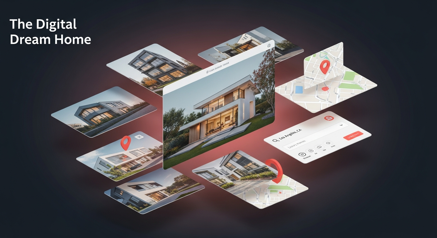
Most real estate websites in 2026 are still built like brochure databases from 2014: long lists of listings, generic search filters, lazy hero photos, and a contact form that nobody fills. The few that convert at modern levels — 3-8% lead rates, 30%+ booked viewings from web inquiries — share a tight set of design patterns. This is the playbook.
These 12 patterns are based on what we've shipped for real estate clients in Mallorca, Tuscany, and the US Sun Belt. Some are universal; some are specific to vacation, luxury, or commercial real estate.
TL;DR — the 12 patterns
- Map-first search, not list-first
- The instant lead card (price + contact, no form barrier)
- Hero photo that moves, not stacks of thumbnails
- Three-fact hierarchy above the fold
- Vertical video walkthrough under 90 seconds
- Multilingual listings without compromise
- Currency + unit auto-localization
- Saved searches with email alerts that actually work
- Trust signals on every card
- Agent profile as a sales surface
- Mortgage/cost calculator embedded inline
- Speed-of-response visible to the user
1. Map-first search
The biggest UX mistake in real estate sites in 2026 is putting filters in a sidebar and listings in a long list. The user is making a geographic decision. The map is the primary surface — everything else supports it.
What works:
- Full-screen map with property pins as the default view on desktop and mobile
- Pin clustering for areas with 50+ listings
- Filter overlay that doesn't take more than 30% of screen width
- Snap-to-list when the user wants to compare 5-10 results side by side
- Persistent zoom level when the user navigates back from a detail page
Zillow, Rightmove, Idealista, and Homes.com all have map-first search for a reason — it converts.
When it backfires
For commercial real estate or single-asset sites, map-first is unnecessary. For low-density rural markets (20 listings spread across an entire region), the map can feel sparse. Hybrid map+list works better.
2. The instant lead card
The classic listing card shows: photo, price, beds/baths, sqm. Then forces the user to click into a detail page to find the agent contact. Stop doing this.
In 2026, the listing card itself should include:
- Price prominently (top right or top left)
- 3 facts maximum (beds, baths, sqm — or 1-2 differentiators if better)
- Agent's name + photo + 1-tap contact (WhatsApp, call, email)
- Trust signal (verified, exclusive, new, price drop)
The user doesn't need to click into a detail page to qualify their interest. Move the contact to the card.
When it backfires
If you have 100+ agents and the photo grid becomes noisy, consolidate by office or team. Don't completely hide the agent identity, though — for high-touch sales, the personal connection still wins.
3. Hero photo that moves
Static hero images are inherited from print real estate. In 2026, the hero should be:
- A short looped video (5-10 seconds, autoplay muted)
- OR a slow Ken Burns pan on the strongest photo
- OR a 3-image carousel that auto-advances every 3 seconds
Why: in mobile-first browsing, motion captures the same eye-glance that print photography captured 30 years ago. Static photos read as old.
The format matters: optimize the video at 720p, under 2MB, with H.264 baseline for compatibility. AVIF/WebP for stills. Lazy load everything below the fold.
When it backfires
Hero video that takes 4 seconds to load on mobile = bounce. If you can't optimize properly, fall back to a high-quality optimized stills carousel.
4. Three-fact hierarchy above the fold
The listing detail page is where most sites collapse. They show 40 fields in a tight grid and call it data architecture.
The pattern that converts in 2026:
- Hero photo (full-width, with subtle gradient overlay for text)
- Price (huge, top-right of the hero or directly below)
- Three differentiators as the next-most-prominent element ("Sea view", "Pool", "Walk to center" — choose what makes THIS property different)
- Agent contact card visible at the same screen as the hero
- Then everything else — full specs, amenities, descriptions, neighborhood
The user qualifies in 5 seconds. Make those seconds count.
5. Vertical video walkthrough under 90 seconds
For mid-to-high-end properties (€300K+, vacation rentals, commercial), a vertical video walkthrough has become the single highest-impact addition to the listing page in 2024-2026.
What works:
- 9:16 aspect ratio (designed for mobile-first viewing, easily reusable for IG/TikTok)
- Under 90 seconds (longer kills retention — people scroll on)
- No talking voiceover — let the property speak with ambient sound + on-screen captions for highlights
- Embedded directly in the listing, not gated behind a form
- Cross-posted to Instagram, TikTok, YouTube Shorts (the same asset earns its keep 4x)
Cost: €300-800 per video using a local videographer. Pays back in 1-2 closings.
When it backfires
Long horizontal "estate cinematography" videos (4-6 minutes) underperform short verticals on the listing page. Save them for high-end portfolio cases shown to qualified buyers.
6. Multilingual listings without compromise
This is the single biggest gap we see in international real estate sites. The pattern that breaks: using Google Translate for listing copy.
What works:
- Top 50-100 listings translated by humans (€20-40 per listing in cost — peanuts)
- Tail listings auto-translated with a clear "auto-translated, original in [language]" notice
- Language-specific URL paths (/en/property/123, /de/property/123)
- Proper
hreflangtags in the page head - Currency and unit conversion done in display, not by storing duplicate data
The biggest psychological lift for international buyers isn't translation accuracy — it's seeing that somebody at this agency speaks my language well. Auto-translated copy fails this test in two sentences.
7. Currency + unit auto-localization
A buyer from London comparing two villas wants to see prices in GBP and dimensions in square feet. A buyer from Frankfurt wants EUR and square meters. A buyer from New York wants USD and square feet.
Detect by:
- GeoIP for the first guess
- User selector in the header (small, persistent, remembered in cookie)
- Optional account preference if the user creates one
What converts: showing both currencies on the listing card ("€450,000 · ~£385K") for high-value international markets.
When it backfires
Don't auto-convert to dozens of currencies. Pick the top 5-8 your market actually uses (typically EUR, GBP, USD, CHF, NOK, SEK for European markets) and show only those.
8. Saved searches with email alerts that actually work
Most real estate sites have "save search" as a feature. Almost no real estate sites send useful emails when new properties match.
What works:
- One-click save from the search results page (no account required at first)
- Email confirmation captures the user without forcing signup
- Frequency-tunable alerts (instant, daily, weekly)
- One-tap unsubscribe without anger
- Match notifications that include the photo, price, and direct link — not generic "new property!" notifications
This single feature can become 20-30% of all qualified leads for a high-velocity agency.
9. Trust signals on every card
Buyers in 2026 are skeptical. Deepfakes of properties, fake listings, scam vacation rentals — the noise is loud. Real estate sites that win in this environment embed trust signals visibly:
- Verified listing badge (owner-verified, agency-verified)
- Last updated date (recency matters for prices and availability)
- Photos: real or virtual? label (especially for new builds)
- Agency credentials (registration number, license, regulator)
- Reviews from other buyers (Google Reviews, Trustpilot embedded)
For vacation rentals, add: license number if regulated (in Spain ETV, in Italy CIN, in France numéro d'enregistrement).
10. Agent profile as a sales surface
The agent's profile page is a critical conversion surface — and most real estate sites treat it like an org chart entry.
What converts:
- Headshot taken professionally (no selfies)
- Specialization stated clearly (luxury villas, urban apartments, commercial — pick a niche)
- Languages spoken (huge for international buyers)
- Recent closings (with photos and prices when allowed)
- Reviews from past clients
- Multiple contact methods (WhatsApp, call, email, calendar booking)
- Video introduction (optional but powerful for high-touch sales)
A well-built agent page can carry the same conversion power as 5 listing pages.
11. Mortgage/cost calculator embedded inline
For purchase listings: an inline mortgage calculator on the listing page itself. For rental listings: a "first-month + deposit + fees" total. For commercial: a "fully-loaded monthly cost" estimator.
The pattern: the calculator is visible on first scroll, pre-populated with the listing price, and adjustable in real time. No modal, no separate page.
The conversion lift comes from removing the "I need to figure out if I can afford this" mental gap. When the user can see "€2,400/month for 25 years at 3.8%" right there, they qualify themselves and contact you only when serious.
12. Speed-of-response visible to the user
The single biggest predictor of close rate in 2026 real estate isn't price, photos, or location — it's how fast the agent responds to the first inquiry. Studies consistently show that contacts answered within 5 minutes close at 5-10x the rate of contacts answered within 24 hours.
Show this on your site:
- "We respond within 30 minutes" as a visible promise on the contact form
- Live chat with operator hours clearly stated
- WhatsApp link for immediate response (the single highest-converting contact channel in many European markets)
- Last-response stats ("Average response time: 14 minutes") shown on agency pages
Then deliver on the promise. Speed is now part of the brand.
What ties these patterns together
They all assume the user is in the moment of decision and will leave for a competitor in 30 seconds if you make them work. They all treat the listing as a sales conversation, not a database row. And they all pay off on the metric that matters most: qualified inquiries that turn into deals.
The real estate sites winning in 2026 are the ones where every pattern on this list feels obvious. That's the quiet sign of great UX: invisible to the user, devastating to competitors.
Want a UX audit of your real estate site? We run 2-week diagnostic sprints that map your search, listing, lead-capture, and agent flows against these patterns, and return a prioritized roadmap. Talk to us.
Frequently asked questions
About the author
Design & Engineering Team
The UX Studio design and engineering team publishes practical notes on digital strategy, user experience, accessibility and implementation. The articles draw on work documented in the portfolio, including EduSpera, ClassWolf and the SupaSailing / SupaMaritime ecosystem.