Travel Website Design 2026: 12 Booking Flow Patterns That Convert
How modern travel websites design their booking flows in 2026. Search UX, multi-leg itineraries, ancillaries, multilingual conversion patterns, and the design decisions that move bookings.
6 min read
The travel website is one of the most demanding UX problems in commerce. Multi-criteria search, dynamic pricing, complex inventory, multilingual flows, mobile-first reality, and trust requirements that exceed almost any other category. The websites that win in 2026 share a tight set of design patterns — many borrowed from the OTAs (Booking.com, Expedia, Skyscanner) and adapted for direct-to-consumer operators, tour platforms, and specialized travel brands.
This article distills the 12 patterns we've seen consistently move conversion across travel projects we've shipped: tour operators, vacation rental platforms, experience marketplaces, and direct-booking hotel groups.
TL;DR — the 12 patterns
- Search above the fold with all critical criteria visible
- Total pricing upfront including all fees and taxes
- Multi-leg and flexible date support in primary search
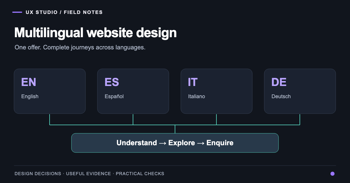
- Multilingual booking flow with human translation
- Trust signals at every step (reviews, cancellation, security)
- Mobile-first design with desktop as enhancement
- Ancillary upsells that feel like value, not friction
- Saved itineraries and price alerts
- Contextual urgency when truthful (room scarcity, fare changes)
- Customer service options visible at the moment of doubt
- Smart defaults (1 adult, today's dates, common origin)
- Recovery flows for abandoned carts and saved searches
Why travel UX is uniquely difficult
Four constraints make travel design harder than most ecommerce:
1. Search dimensions multiply. Date, location, party size, budget, preferences, sometimes class, sometimes meal plan, sometimes accessibility — all must combine into a search experience that feels simple.
2. Inventory is fluid. Available flights, rooms, tours change minute-by-minute. Static catalogs decay; real-time availability is mandatory.
3. Pricing is dynamic and complex. Total price often differs 20-40% from the headline. Trust is built or broken at the price reveal.
4. Trust and emotion mix. Travel decisions involve money + emotion + risk. UX must serve both rational evaluation and emotional engagement.
The 12 patterns in detail
1. Search above the fold
For OTAs and aggregators, the search widget is the homepage. For tour operators and experience platforms, search must be visible above the fold even on mobile.
What works: dates, party size, location/category, and a clear primary CTA — all visible without scroll. Advanced filters live in a secondary view, not buried.
2. Total pricing upfront
The pattern that defines 2026 travel UX. Show the total price the user will pay — including taxes, fees, expected gratuities, mandatory ancillaries — at the moment of search results.
Sites that hide fees lose 30-50% at the checkout reveal. Sites that show honest totals build trust and convert better even at higher headline prices.
3. Multi-leg and flexible dates
Modern travelers don't always book A-to-B on fixed dates. Support:
- Multi-leg itineraries (open-jaw, multi-city)
- Flexible date search (±3 days, weekend matrix)
- Anywhere search for inspiration shoppers
- Calendar views showing pricing by date
The user doesn't always know when they're traveling — help them figure it out.
4. Multilingual booking flow
Top markets get human-translated booking flows. The booking engine must speak EN + DE + ES + FR + IT minimum for European travel. For Asian markets, add JP, KO, ZH.
The line that matters: the cart and checkout, not just marketing pages. Auto-translated checkout = abandoned cart.
5. Trust signals at every step
Reviews, cancellation policies, security badges, certifications — visible at:
- Search results (rating, reviewer count)
- Detail page (review snippets, cancellation summary)
- Cart (security badge, cancellation policy reminder)
- Checkout (insurance options, support contact)
- Confirmation (review request prompt 3 days post-trip)
6. Mobile-first design
Over 50% of travel research starts on mobile in 2026. Bookings completed on mobile have grown to 35-45% in most categories.
Specific mobile requirements:
- Search widget thumb-friendly
- Filter UI without horizontal scroll
- Booking flow under 60 seconds end-to-end
- Apple Pay / Google Pay as primary payment options
- Persistent contact CTA (WhatsApp / phone) on every screen
7. Ancillary upsells that feel like value
Insurance, baggage, seat selection, transfers, excursions — when offered well, these add 15-30% to AOV. When offered badly, they feel like extortion.
What works:
- Pre-selected when truly recommended (with easy opt-out)
- Bundled in clear packages (basic / plus / premium)
- Shown with clear value framing ("for $20 more, get…")
- Removable in a single tap
8. Saved itineraries and price alerts
Travel research takes weeks. Help users come back:
- Save search (one click, no account required at first)
- Price alerts (email when prices change for saved searches)
- Wishlist for trips, tours, destinations
- Recent searches persistent across sessions
These features generate 20-30% of bookings for high-velocity travel platforms.
9. Contextual urgency (when truthful)
Honest scarcity messaging works:
- "Only 2 rooms left at this rate" (when true)
- "Prices up 12% in the last 24 hours for these dates" (when true)
- "5 other people are looking at this hotel" (when verifiable)
Fake urgency erodes trust and triggers regulatory action in some markets (EU Digital Services Act). If you can't verify the message, don't show it.
10. Customer service visible at moments of doubt
The moments users wonder if they should book:
- Result page (filter is overwhelming)
- Detail page (too good to be true)
- Cart (last-minute hesitation)
At each, surface customer support options: chat, WhatsApp, phone, callback request. Travel decisions are emotional; reassurance closes deals.
11. Smart defaults
Pre-fill what you can guess:
- Origin from GeoIP
- Currency from country
- Language from browser/region
- Common dates (next weekend, next month)
- Adult party size = 2 (most common)
Each default removed from the user is a small conversion lift.
12. Recovery flows
For abandoned carts:
- Save cart for 24-72 hours (visible on return)
- Email reminder (24 hours after abandonment)
- Price-change notification if rate dropped
- Re-engagement offer (free upgrade, perk) for high-value abandons
For saved searches:
- Weekly digest of new options
- Price-change alerts
- Inspiration emails for related destinations
Booking engine and platform choices
For different operator sizes:
| Operator type | Recommended platform | Typical budget |
|---|---|---|
| Single tour operator | Bokun, FareHarbor, TourCMS | $5K-15K setup |
| Vacation rental host | Lodgify, Hostaway, OwnerRez | $5K-25K setup |
| Mid-size travel agency | Custom Next.js + booking API | $40K-150K |
| OTA / experience platform | Custom build | $200K+ |
| Hotel group | SiteMinder/Cloudbeds + custom theme | $30K-200K |
Common travel UX mistakes
- Hidden total pricing — biggest conversion killer in 2026
- Slow mobile — over 4-second LCP loses 50%+ of users
- Auto-translated booking flow — trust dies at payment
- No saved search/cart — users come back, find no record
- Forced account creation before pricing or details
- Generic "request quote" buttons instead of inline pricing
- No customer service surface during the booking flow
How to evaluate a web partner for travel
Travel-specific questions:
- Have you integrated with [your booking engine / API]?
- How do you handle dynamic pricing and currency display?
- Have you built multilingual booking flows?
- Can you show a travel site you've built with year-over-year conversion data?
- How will you handle Core Web Vitals on a content-heavy travel site?
If you're building or rebuilding a travel website, we offer a free 30-minute consultation to review your current setup or scope a new build. Honest assessment, no upsell.
Frequently asked questions
About the author
Design & Engineering Team
The UX Studio design and engineering team publishes practical notes on digital strategy, user experience, accessibility and implementation. The articles draw on work documented in the portfolio, including EduSpera, ClassWolf and the SupaSailing / SupaMaritime ecosystem.