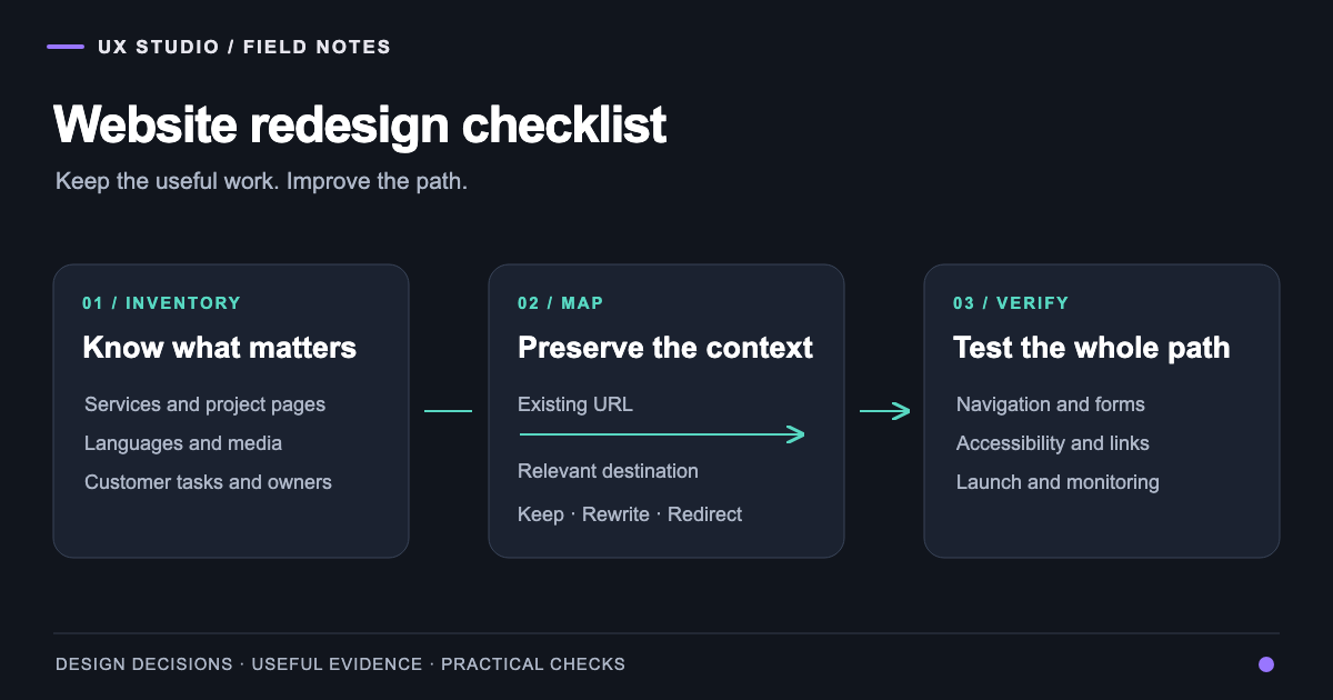
UX Audit Checklist 2026: 30 Items to Test in 2 Weeks
A complete UX audit checklist for 2026. Heuristic evaluation, accessibility, performance, conversion, and AI-era considerations. The exact framework we use on client audits.
7 min read
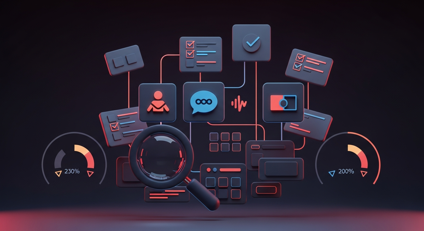
A UX audit done well is one of the highest-ROI design investments a company can make. Done badly, it produces a 50-page PDF nobody reads. The difference is in the framework. This is the framework we use at UX Studio when running paid audits for clients — refined across 50+ engagements in 2024-2026.
The audit is structured as 30 items across six dimensions. We typically deliver against the full checklist in 1-2 weeks for a single product, with a prioritized roadmap as the primary output.
TL;DR — the 6 audit dimensions
- Heuristic evaluation (5 items) — Nielsen's 10 heuristics applied
- Accessibility (5 items) — WCAG 2.2 AA compliance check
- Performance (5 items) — Core Web Vitals + perceived speed
- Conversion (5 items) — funnel analysis, friction points, drop-offs
- Content and copy (5 items) — clarity, voice, microcopy quality
- AI and modern UX patterns (5 items) — 2026 expectations
Each item gets: severity (critical/high/medium/low), effort to fix (S/M/L), and recommended next step.
Dimension 1: Heuristic evaluation
1. Visibility of system status
Test: Do users always know what's happening? Loading states, success confirmations, error states, processing indicators visible at every interaction.
Common failures: 5+ second operations with no feedback. Form submissions that show no confirmation. Background processes the user can't track.
2. Match between system and real world
Test: Does the language and structure match user mental models? Are technical terms, jargon, or system-internal vocabulary leaking into the UI?
Common failures: "User-Account Settings" instead of "Profile". Database field names exposed in the UI. Concepts that make sense to engineers but not to users.
3. User control and freedom
Test: Can users undo, exit, or recover from any state? Are there clear escape hatches? Is destructive action confirmable?
Common failures: No undo for accidental delete. Modal dialogs you can't close. Multi-step forms that lose data on back-button.
4. Consistency and standards
Test: Are similar elements treated similarly? Do interaction patterns match platform conventions (web, iOS, Android)?
Common failures: Buttons styled three different ways for the same action. Custom date pickers when the native one works. Mixed iconography.
5. Error prevention and recovery
Test: Are common error states prevented before they happen? When errors do happen, are the messages clear, actionable, and human?
Common failures: "Error 500" with no explanation. Validation that fires after submit instead of inline. No suggestion for how to fix the problem.
Dimension 2: Accessibility (WCAG 2.2 AA)
6. Color contrast
Test: All text meets WCAG 2.2 AA contrast (4.5:1 for normal text, 3:1 for large). Test with axe DevTools or Lighthouse.
Common failures: Light gray placeholder text. Brand colors that don't pass on white backgrounds. Status indicators that rely only on color.
7. Keyboard navigation
Test: Every interactive element reachable and operable via keyboard. Visible focus indicator. Logical tab order.
Common failures: Custom dropdowns that don't open with keyboard. Modal traps that don't close with Esc. Hidden focus rings.
8. Screen reader compatibility
Test: All non-text content has alt text. Form fields have labels. ARIA roles where appropriate. Test with VoiceOver/NVDA.
Common failures: Decorative SVGs announced to screen readers. Form fields with placeholder-only labels. Generic "click here" link text.
9. Cognitive accessibility
Test: Reading level appropriate for audience. Forms broken into manageable chunks. Time-sensitive operations adjustable or pausable.
Common failures: Dense legal copy. 30-field forms on one screen. Carousels that auto-advance without controls.
10. Motor accessibility
Test: Click/tap targets at least 44×44px (WCAG 2.2 AAA). Drag interactions have keyboard alternatives. No precision gestures required.
Common failures: Tiny mobile buttons. Drag-only sorting. Hover-only menus.
Dimension 3: Performance
11. Largest Contentful Paint (LCP)
Test: LCP under 2.5s on mobile (4G). Use Lighthouse, PageSpeed Insights, or real-user monitoring.
Common failures: Unoptimized hero images. Above-the-fold render-blocking JS. Inefficient web fonts.
12. Cumulative Layout Shift (CLS)
Test: CLS under 0.1. No content jumping during load.
Common failures: Images without dimensions. Late-loading ads. Web fonts causing reflow.
13. Interaction to Next Paint (INP)
Test: INP under 200ms. Interactions feel snappy.
Common failures: Heavy JavaScript on input handlers. Synchronous API calls during typing. Unbatched re-renders.
14. Time to First Byte (TTFB)
Test: TTFB under 600ms. Server response is fast.
Common failures: Unoptimized backend queries. No CDN. Unnecessary server-side rendering for static content.
15. JavaScript bundle size
Test: Initial JS bundle under 300KB compressed. Defer non-critical JS.
Common failures: Loading entire libraries for one feature. Polyfills for browsers nobody uses. Tracking scripts that block render.
Dimension 4: Conversion
16. Funnel completion rate
Test: Identify the primary conversion funnel (signup, purchase, lead capture). Measure step-by-step completion rate.
Common failures: Funnels that lose 70%+ at one specific step (usually a friction-heavy form). No funnel measurement at all.
17. Form friction
Test: Number of fields, validation timing, error recovery, autofill compatibility.
Common failures: 12-field forms when 4 would do. Validation on blur instead of inline. Required fields not marked.
18. Call-to-action clarity
Test: Primary CTA visible above the fold on key pages. Action verb in CTA copy. Visual hierarchy makes primary action obvious.
Common failures: "Submit" instead of "Get my quote". Five competing CTAs on one screen. Primary CTA below the fold on mobile.
19. Empty states and zero-data
Test: Empty states pre-populate, suggest, or guide instead of just saying "nothing here".
Common failures: Bare empty states. No path to first action. Sample data confused with real data.
20. Trust signals
Test: Security badges, certifications, customer logos, reviews, testimonials placed at moments of friction.
Common failures: Trust signals only on the homepage. No social proof at checkout. Reviews not visible on product pages.
Dimension 5: Content and copy
21. Voice and tone consistency
Test: Read 10 random pages or surfaces. Does the brand voice come through consistently?
Common failures: Marketing-speak in product UI. Casual brand voice abandoned in legal copy. AI-generated copy that doesn't match brand.
22. Microcopy quality
Test: Button text, error messages, empty states, tooltips, form labels — are they clear, helpful, human?
Common failures: "Submit", "OK", "Click here". Apologetic error messages with no remediation. Tooltips that just repeat the label.
23. Information hierarchy
Test: Most important information most prominent. Less important information present but secondary.
Common failures: Equal visual weight for all elements. Critical price/CTA buried below the fold. Key facts hidden in long paragraphs.
24. Localization quality
Test: All translations are human-quality. Cultural conventions respected (date formats, currencies, name order).
Common failures: Google Translate output that reads stilted. Hardcoded English in non-English versions. Hreflang errors.
25. Reading level appropriateness
Test: Content matches audience reading level. Use Hemingway or similar tools.
Common failures: B2B SaaS at PhD reading level. Consumer products at university level. Legal copy unreadable to most.
Dimension 6: AI and modern UX patterns
26. AI feature integration
Test: If AI features exist, are they discoverable, contextual, and producing real value?
Common failures: AI chatbot bolted on as a marketing feature. No clear value proposition for AI use. Hallucinations not handled.
27. Command palette
Test: For complex products, is there a Cmd+K command palette? Discoverable, comprehensive, fast?
Common failures: No command palette in apps that need one. Command palette that only does navigation, not actions.
28. Loading and async UX
Test: Long operations have progress indicators, time estimates, and the ability to navigate away.
Common failures: Spinner with no progress information. Operations that block the entire UI. No retry mechanism on failure.
29. Mobile-first reality
Test: On mobile, is the experience first-class — not a stripped-down desktop?
Common failures: Desktop-first design that "responsive-shrinks" to mobile. Touch targets too small. Mobile flows that require horizontal scrolling.
30. Dark mode
Test: Dark mode supported and properly designed (not just inverted colors). Persistent across sessions.
Common failures: No dark mode in apps where users spend hours. Dark mode that breaks color contrast. Auto-switching that overrides user preference.
How to actually run the audit
The audit isn't done in 30 minutes by checking off items. The full process:
Setup (1 day): tools (Lighthouse, axe DevTools, BrowserStack, Hotjar/Fullstory if available), access (admin accounts, analytics, error tracking), context briefings with stakeholders.
Heuristic and accessibility pass (3-5 days): walk through all major flows and screens. Document issues with screenshots, severity, and recommendations.
Performance pass (1-2 days): run Lighthouse, PageSpeed Insights, WebPageTest. Pull real-user data from CrUX or analytics if available. Identify slowest pages.
Conversion pass (1-2 days): pull funnel data from analytics. Run heatmaps if available. Identify highest-impact friction points.
Content audit (1-2 days): read 20-30 pages or screens. Document voice issues, microcopy failures, hierarchy problems.
Synthesis and prioritization (1-2 days): rank all issues by impact × effort. Build a remediation roadmap. Identify quick wins (1-2 weeks) vs. major projects (1-3 months).
Presentation (half day): walk stakeholders through findings, demo critical issues live, align on next steps.
What to do with the audit output
The audit is worthless if it sits in a drawer. The strongest follow-up patterns:
- Quick wins sprint (2-4 weeks): fix all S-effort/H-impact issues immediately. Typically 30-50% of identified issues.
- Quarterly remediation for M-effort items, batched into focused 2-3 week sprints.
- Major refactors for L-effort items planned into the product roadmap with priority weighting.
- Re-audit at 6-12 months to measure progress and surface new issues.
If you want a UX audit run on your product against this framework, we offer a free 30-minute scoping call to size the engagement. No upsell — just an honest read on whether an audit is the right next investment for you.
Frequently asked questions
About the author
Design & Engineering Team
The UX Studio design and engineering team publishes practical notes on digital strategy, user experience, accessibility and implementation. The articles draw on work documented in the portfolio, including EduSpera, ClassWolf and the SupaSailing / SupaMaritime ecosystem.